

STRATEGY + POSITIONING
The brief: Build a brand around a performance sock designed for sensation, not just category.
The insight: For too long, generalists have been underestimated. But the world is shifting from single-sport identities to multidimensional mastery. Today’s athletes run, ride, lift, hike, and move between pursuits with ease and intention—not to dabble, but to evolve.
Courier was conceived to champion the Renaissance Athlete: the ones who embrace versatility as a vehicle for growth. They don’t reject labels. They transcend them. Because true performance isn’t just about speed or mileage. It’s about sensation, adaptability, and showing up with purpose, no matter the pursuit.
We built Courier’s brand from the ground up—starting with strategy and extending through name, identity, voice, storytelling, and go-to-market. The result is a brand that moves like its athletes: confident, clever, and multidimensional. From tech-forward product copy to launch campaigns to environmental design, Courier shows up with a unique mix of performance credibility and carefree charisma.


VISUAL IDENTITY

Brand Elements:
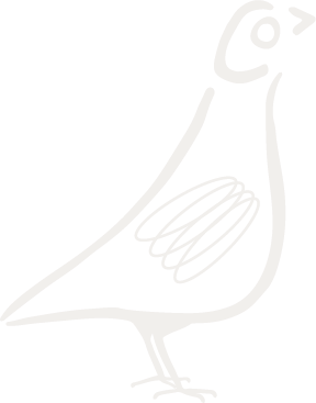
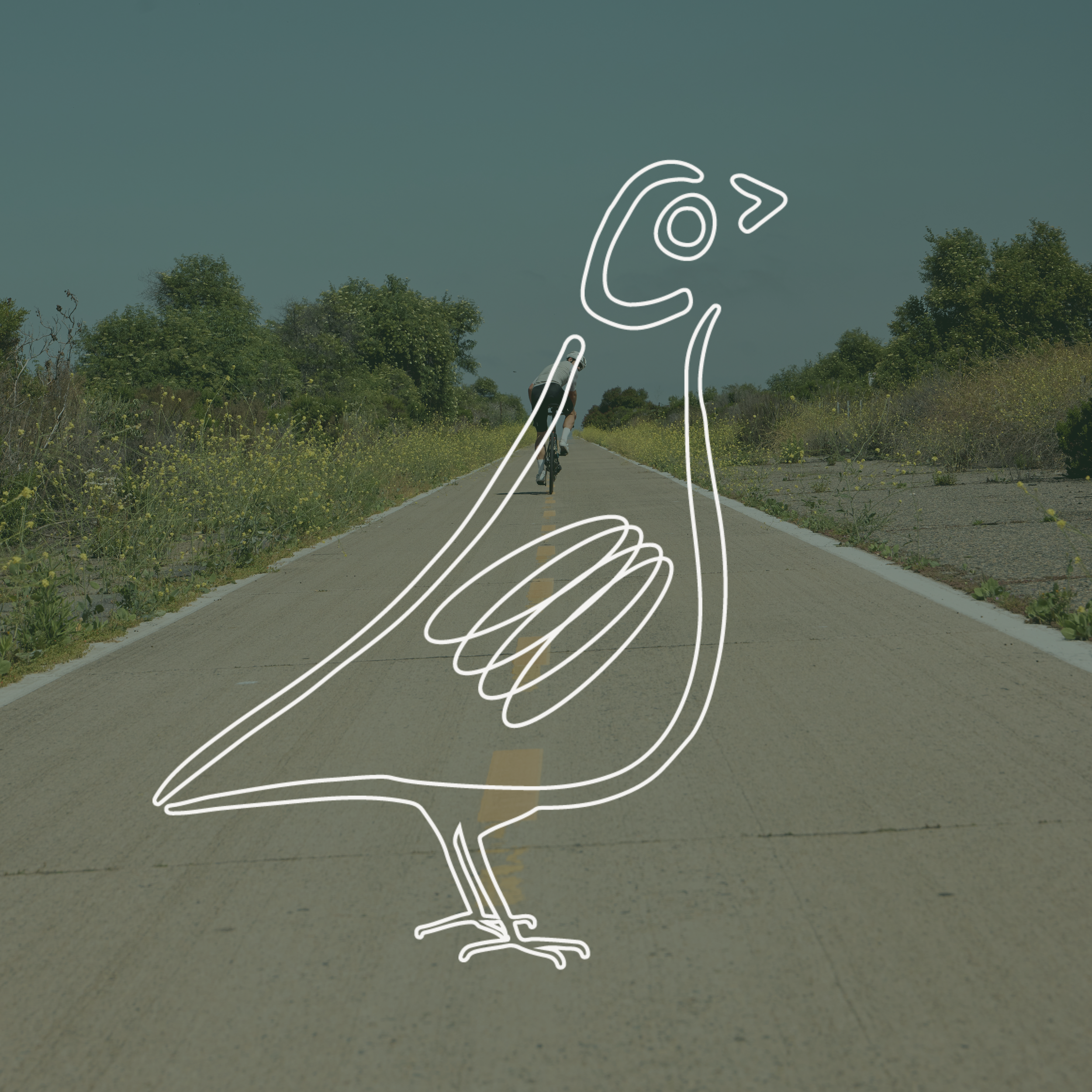
A hand-drawn courier pigeon, paired with a sleek wordmark, serves as a representation of the brand’s innovative product and it’s witty, charismatic tone.


Alts:

Type System:
We implemented a dynamic sans serif with a diverse range of weights & widths, and paired it with a boyish, handwritten accent font to keep things authentic.

Color System:
Inspired by the flora + fauna of New Zealand, Courier’s color system is vibrant and flexible, incorporating jewel tones that often escape the industry.
